
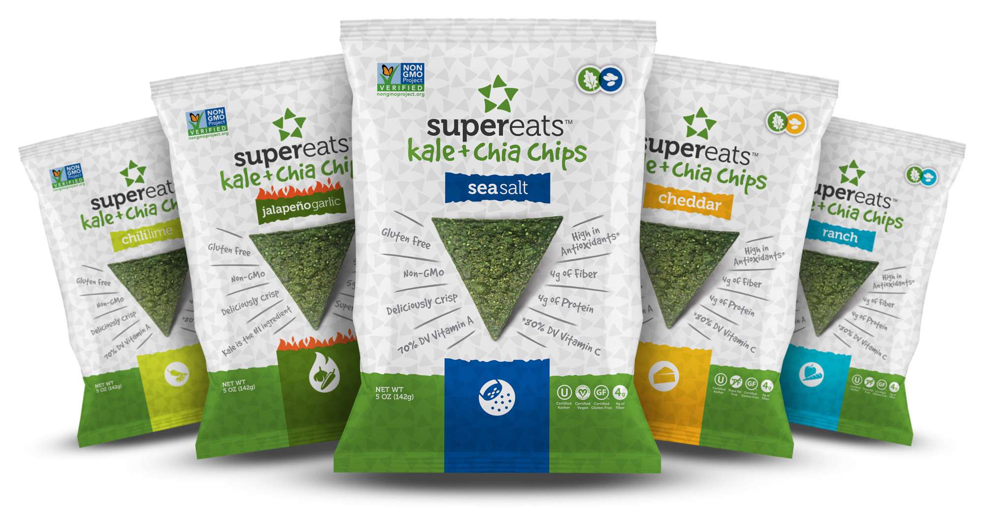
SUPER food MEETS SUPER BRAND.
The original brand identity, packaging, tradeshow displays, and a full e-commerce site were all elements of the brand I was chosen to develop.
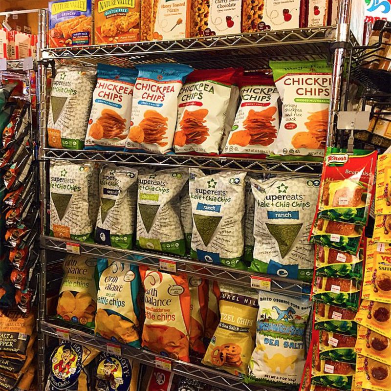
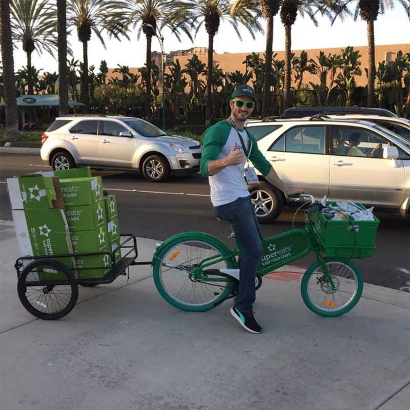
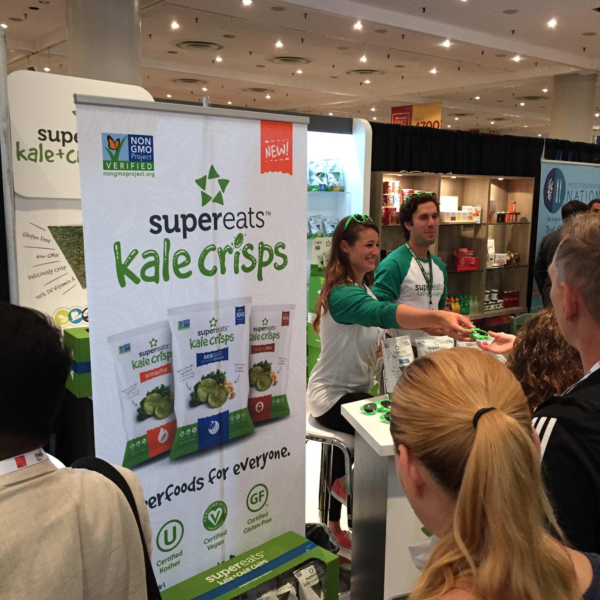
Supporting all marketing needs since SuperEats' inception, the company's sales boosted to $2.1M and increased distribution to 3,000 stores nationwide in just 3 years.


SUPER FOOD PHOTOGRAPHY.
I shot and edited every product shot on the SuperEats packaging.


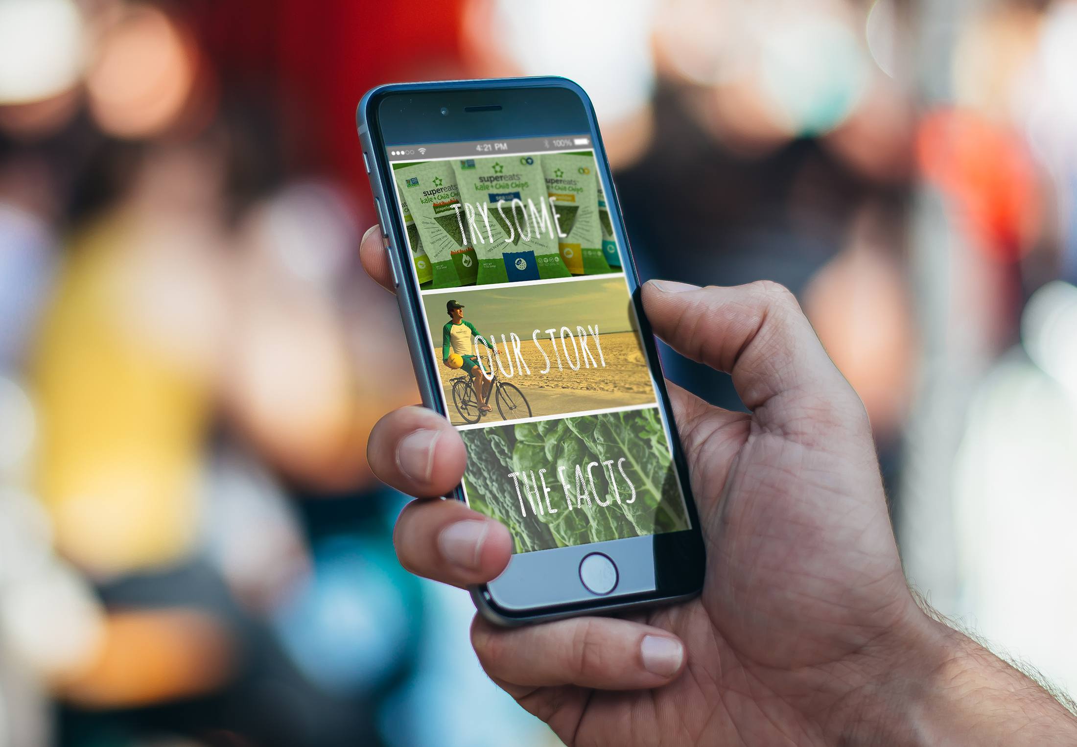
SUPER FOODS FOR EVERY DEVICE.
Bringing SuperEats to the digital space, I designed a responsive e-commerce experience that captures the brand's energy.
See more at supereats.com


Package of Grainful gluten-free breakfast featuring a food photo of cooked grains with vegetables in a white bowl, and the words 'Oat-mazing' and '100% Delicious' written in oat grains on a beige background.

The phrase 'Choose Happy' written on a surface using small beige and white star-shaped sprinkles.

Four packages of Grainful Steel Cut Sides, with flavors Jambalaya, Madras Curry, Tomato Risotto, and Cheesy Oats.


pure brand.
The original brand identity, packaging, marketing materials, and a full e-commerce site were all elements of the brand I was chosen to develop.


UPGRADED.
Several emails were created, celebrating the new brand identity.


Two black-and-white promotional posters for the TV show "Orphan Black," featuring different women's faces. The left poster shows a woman with long, wavy hair and the text "I AM NOT YOUR PROPERTY." The right poster features a woman with glasses and the text "I AM NOT YOUR EXPERIMENT." Both mention a new season on BBC America premiering April 18th.

Black and white promotional poster featuring a close-up of a woman's face with the overlaid text 'I AM NOT FOR PROPPERY'. The poster promotes the new season of BBC America’s show 'Orphan Black' premiering on April 18th at 9/8c.

Close-up black and white promotional poster of a woman with the text 'I AM NOT YOUR PROPERTY'. The woman has long, wavy hair and intense eyes, with details about a new season of 'Orphan Black' airing on BBC America on April 18th.

Promotional poster for the TV series "Orphan Black," featuring a black-and-white close-up of a woman with glasses and a nose piercing, with the text, "I AM NOT YOUR EXPERIMENT," and details about a new season premiering on April 18th at 9/8c on BBC America.
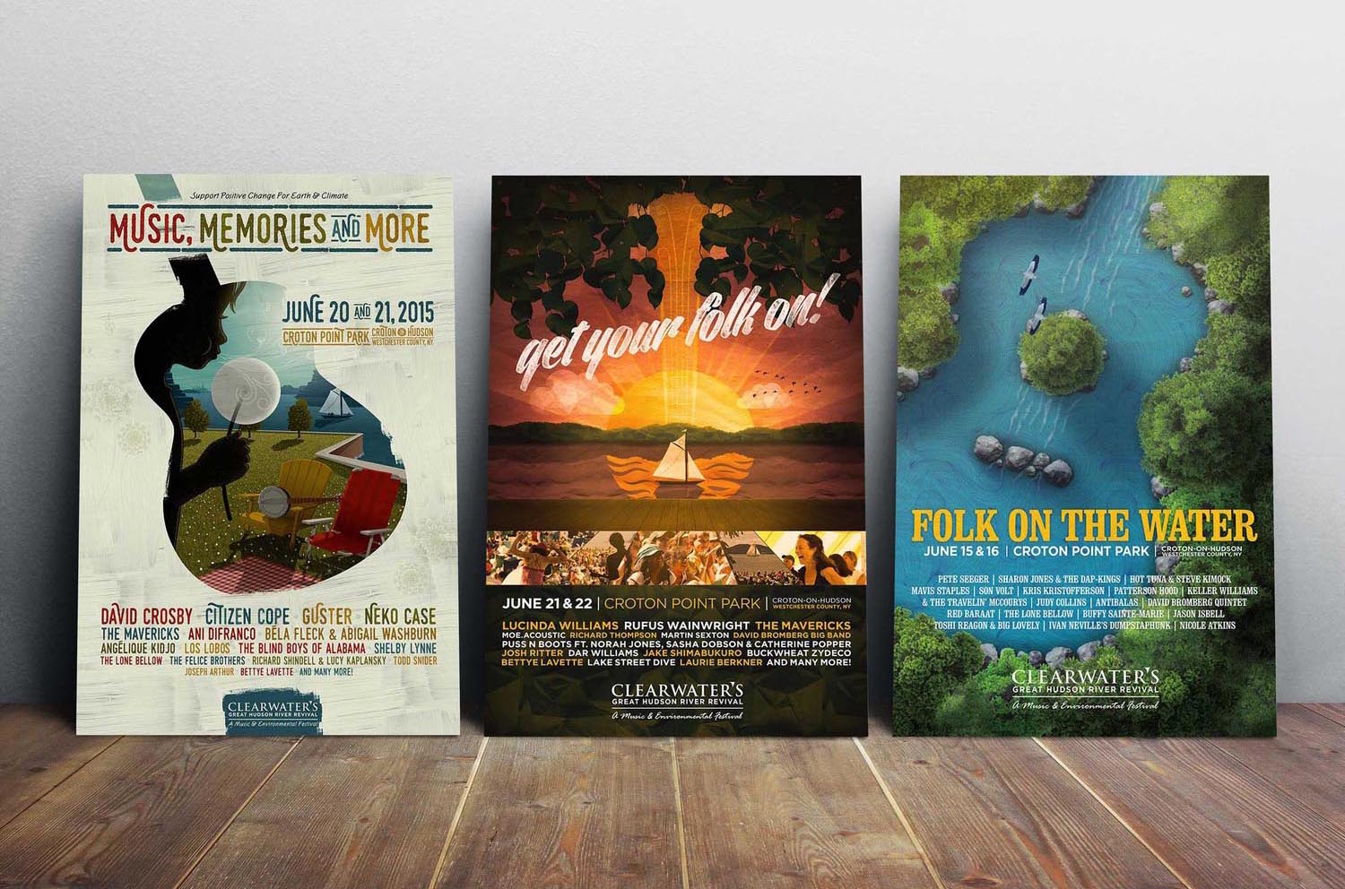
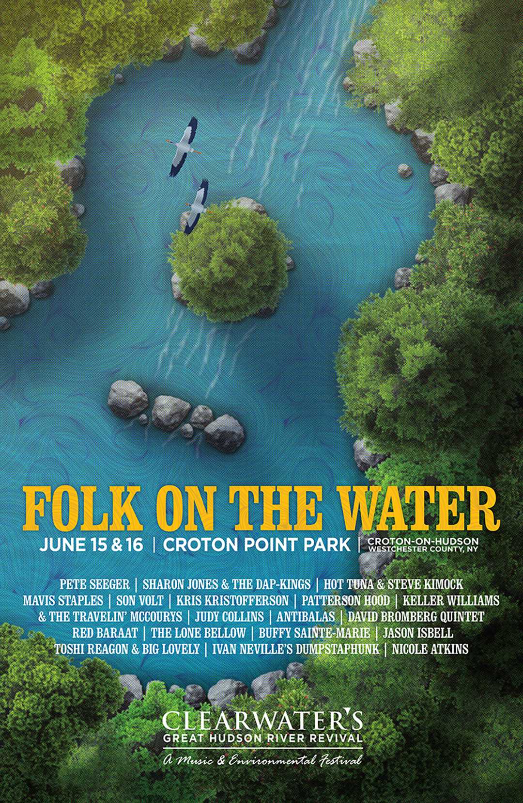
FOLK ON THE WATER.
3 years of poster design.


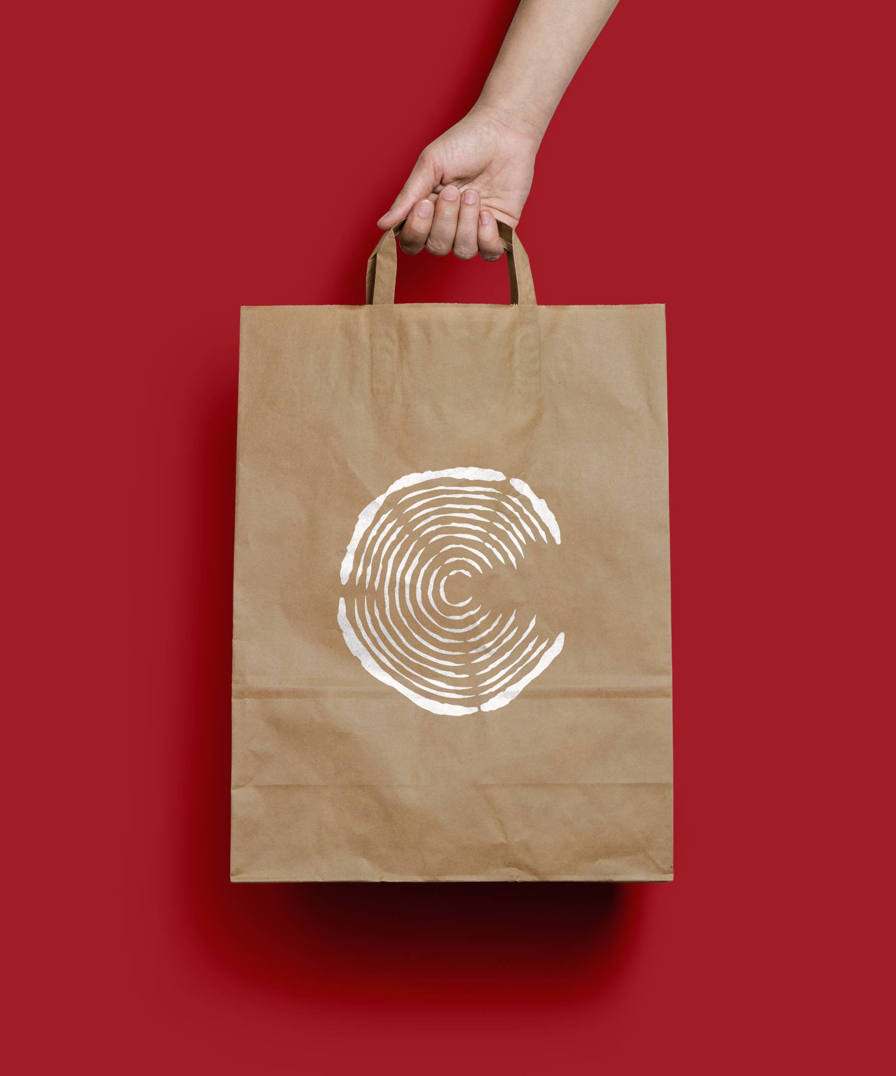
we've got wood.
The brand identity was created to mimic the cross-section of a tree.


GOOD WOOD.


The word 'trumpet' written in black lowercase font on a white background.

Close-up of the word 'thunder' embossed on a gray fabric surface.

Interior view with a white brick wall and wooden floor, three black hanging pendant lights, and the word 'trumpet' displayed on the wall.

Close-up of a maroon athletic shoe with laces tied, with another similar shoe blurred in the background on a wooden surface.

Close-up of a pair of sneakers with a snakeskin pattern on a gray surface with the text 'training' partially visible underneath.

Sign displaying 'Travel Week' with BBC World News logo on a black background.

Travel Week promotion poster featuring a woman with a backpack looking at the sky, event dates October 20-24, 7:30 PM E/P, highlighting five exotic destinations: Cape Town, Philippines, Vietnam, India, and Panama.

Poster advertising BBC World News Travel Week event, October 20-24, with sessions at 6:30 and 9:30 PM, featuring 5 exotic destinations: Cape Town, Philippines, Vietnam, India, and Panama, promoting travel exploration, displayed on a wall near an escalator in an airport.

Laptop screen displaying a Travel Week event poster with a woman in outdoor gear standing on a rock at sunrise, and various travel destinations listed at the bottom.

Billboard advertising Travel Week event from October 20-24 at 7:30 PM on Verizon Fios, with a background of a hiker, blue sky with clouds, and an off-road trail, offering a chance to win a trip across the U.S.

Comparison of the old and new ADAR logo. The 'before' logo has a rounded blue square background with a stylized 'A' in light blue, and the word 'adar' in lowercase black letters on a white horizontal bar. The 'after' logo features a more geometric, stylized 'A' in light blue with darker blue shading, and the word 'ADAR' in bold uppercase white letters below.
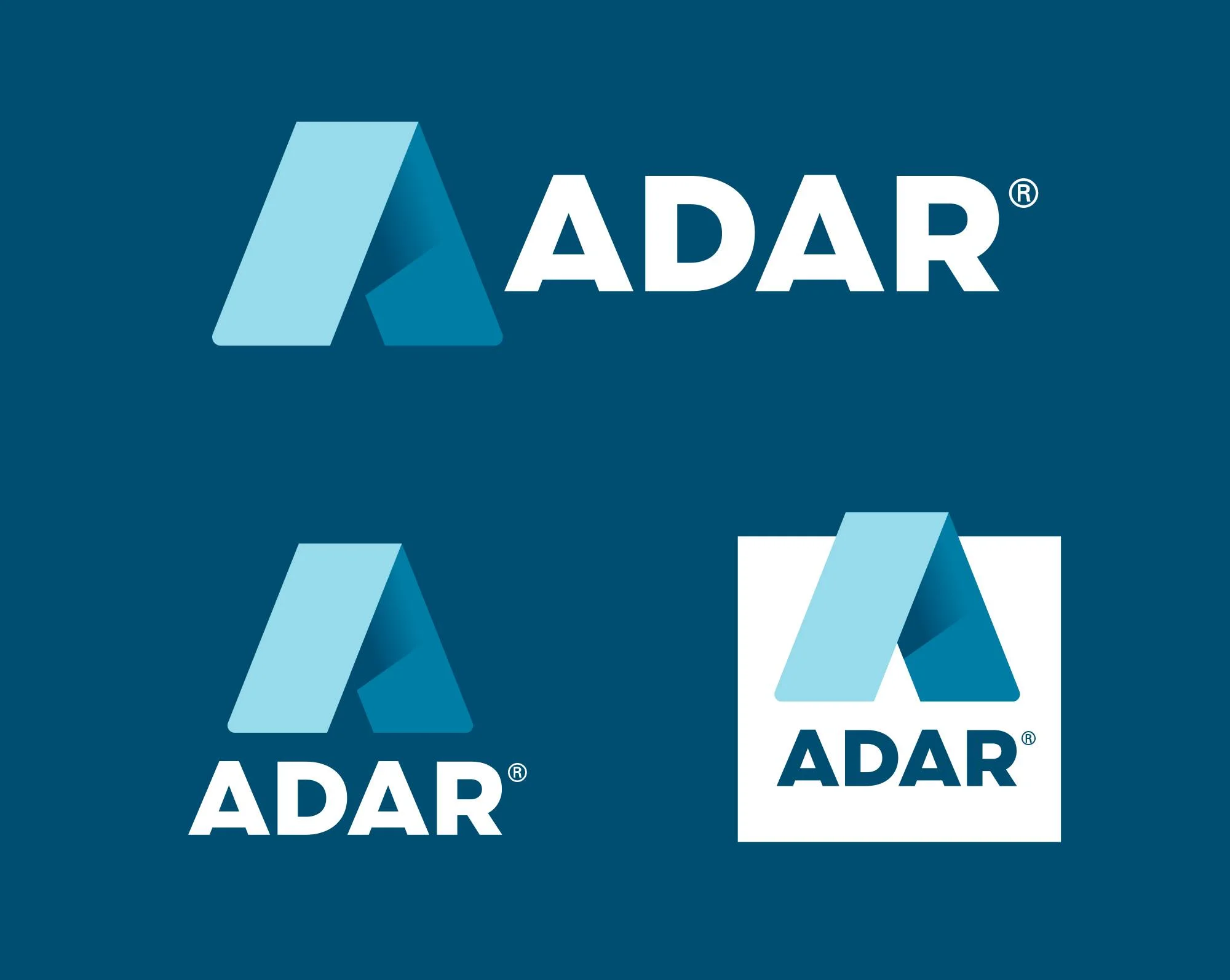
Collection of four variations of ADAR logo featuring a stylized letter 'A' in different design and background styles.

Business cards for ADAR and Herman Teidlebaum.

A smiling female healthcare professional wearing blue scrubs and a stethoscope, with an ADAR logo on her sleeve.

ADAR Pro Gear black lanyard packaging box with blue accents, tilted orientation.

A person holding a smartphone displaying the ADAR app with a smiling woman on the screen and text that says, 'Works as hard as you do.'

ADAR branded blue lanyard with a white tag and metal clip on the left, and a blue hand sanitizer bottle on the right.
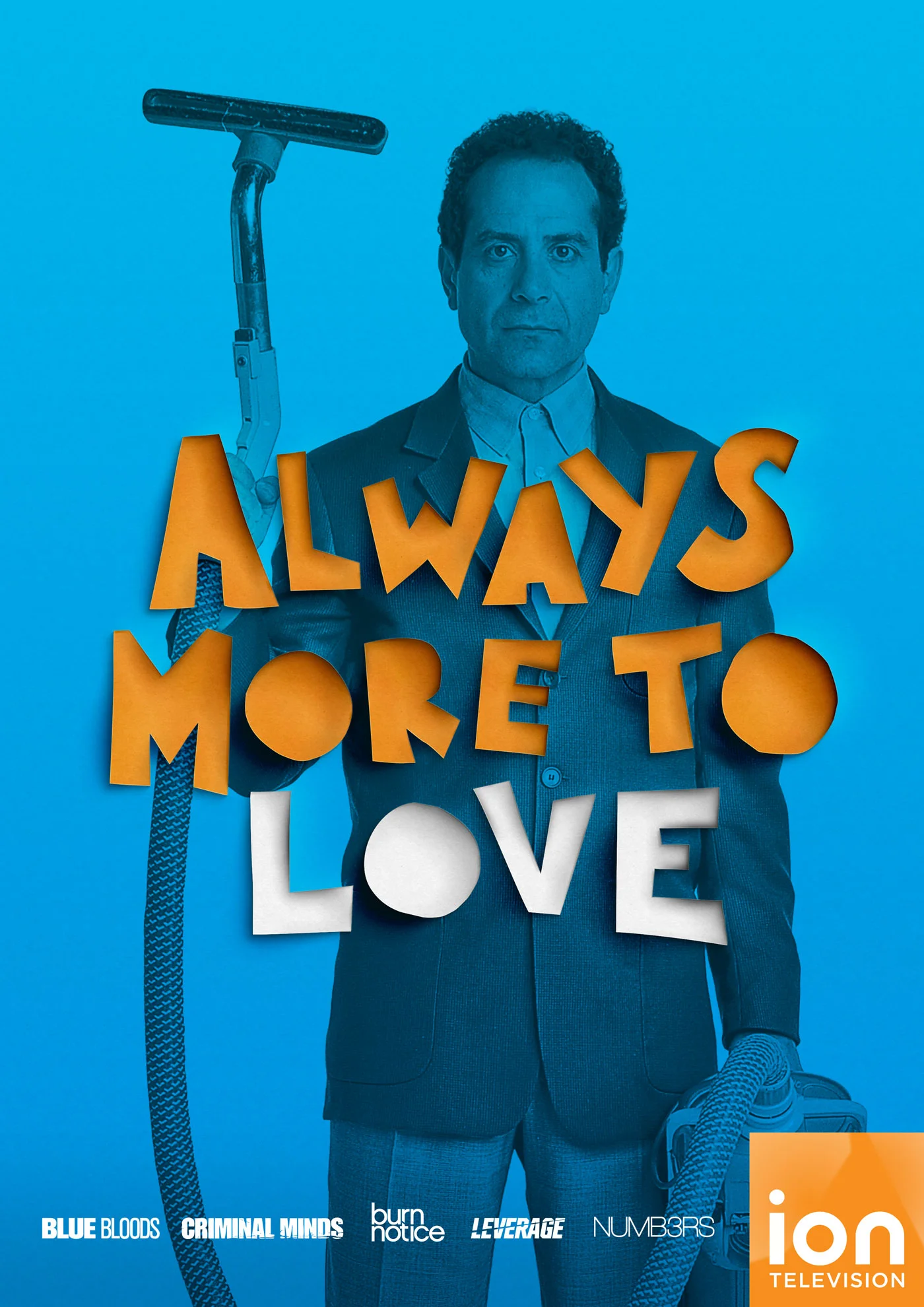
Poster for the TV show 'Always More to Love' featuring a man in a suit holding a vacuum cleaner, with the title overlayed in bold orange and white letters. The background is blue, and there are logos of the channel and production companies at the bottom.

Poster featuring a man in a suit against an orange background with text that reads 'Always 5 More to Love' in white and blue brushstroke font, with logos of Ion Television and other shows at the bottom.
roses are red.
This personal care brand from Bulgaria wanted to highlight their country's most famous national resource, roses.
From conception to design, this illustrative mark was created and applied to several different packaging designs including shampoo bottles and soap boxes.


A DIFFERENT DIRECTION
Another concept was created, using an expressive illustration and custom typographic mark.

new comps
A collection of work done in the past couple months (February-April 2016).